

Hi, i'm Thierry
also known as Mr Designer
I'm a Humanitarian Communication Specialist and Senior Graphic Designer with experiences in the management of the complete design process, from conceptualization to delivery.
E-mail: thierry@uwamungu.com | Phone +250 788 882 871
Resume
Education
Humanitarian Communication
Geneva University - 2021
Learnt how to address the main challenges of communication in emergency settings and how to implement a communication plan in the midst of humanitarian action.
Graphic Design Elements
University of Colorado - 2021
In this hands-on specialization, I explored graphic design elements, color theory, images, publication design and techniques for creating effective layouts. I also learnt about typography, the creative process, the importance of brainstorming, and how to discuss and critique design in a professional setting. Page layout software and online sites were used to incorporate and manipulate text, color, photographs and images.
Journalism and Communication
University of Rwanda - 2014
Here, I acquired excellent interdisciplinary opportunities and the flexibility to shape my university career to best suit the Multimedia Producer I've become.
While I was still studying at University of Rwanda in the school of Journalism and communication i was heading the graphic design team for the institution’s newspaper.
I’m the man behind the beauty of too many album covers, logos, billboards promotional materials and the school graphic style of the era.
Work Experience
iBABA cs
CEO & FOUNDER - 2019 - Present
In a world where everything is the same, iBABA cs has to stand out and make a difference. I created this multimedia company to climb the ladder of new ideas and open doors for growth because creativity has no limits nor does it freeze; iBABA cs team has its own core of Artistry acquired from years of experience and learning which when blended together results to an Artwork masterpiece.
Rwanda Red Cross
Digital Media Producer - 2018 - Present
Developed Communication materials for development and crisis communications during Ebola Preparedness campaigns and COVID-19 Risk communications, Coordinated Community Engagement and Accountability initiatives, Tracked and addressed rumours around the vaccination, Trained personnel on digital media literacy. .
Highland Publishers ltd
Senior Graphic Designer - 2015 - 2018
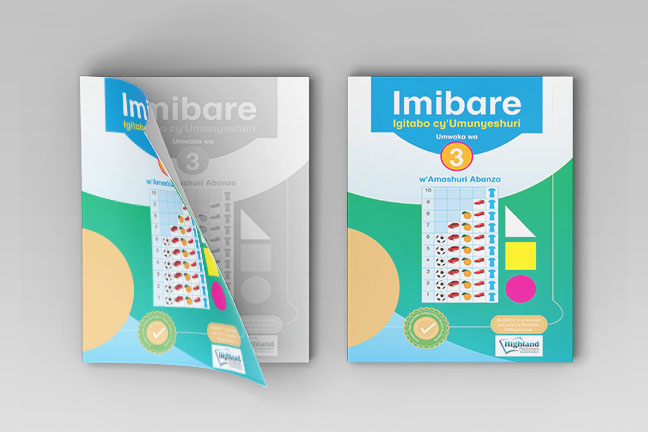
Designed a large number of books later successfully approved by Rwanda Education Board. (Now being used in Rwandan schools)
Testimonials
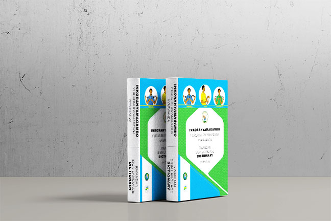
"I worked with Thierry when he was a lead graphic designer on the Rwandan Sign Language Dictionary and other multimedia projects for the past many years and I have always been satisfied with his performance "

RNUD/ Rwanda
"Thierry has been working on illustrations and graphics for a number of our projects. We are impressed with his range of visual style, his ability to meet tight deadlines and the excellent quality of his work "
Great Lakes Youth Network for Dialogue and Peace/ DRC
"Honnête, ponctuel, polyvalent et ouvert d'esprit, Mr Uwamungu a fait preuve de créativité afin de promouvoir les idées nécessaires pour s'adapter à des commandes de natures différentes"

Lyon, France
SKILLS
Professional Skills
-
Community Engagement and Accountability
-
Human Centered Design
-
Graphic Design
-
Corporate Communications
-
Audio-Visual/Multimedia Production
-
Strategic Planning
-
Project Management
-
Leadership
Software Skills
-
Adobe Products
-
Canva
-
GIMP
-
MS Products
-
KoBo Collect
Spoken languages
-
Kinyarwanda
-
Kiswahili
-
French
-
English
-
Rwandan Sign Language
Portfolio
Blog
So here are 8 things you can do if you find out (or decide) you’re not going to be studying design at college or university, to make sure your dream still happens.
1~ Take time to specialise. Logo design skill are always in demand. …
2~ Master the software. Photoshop skills are pretty much essential for graphic designers. …
3~ Invest in the tools. Invest in a good laptop. …
4~ Learn how to write. …
5~ Develop your style. …
6~ Build an online portfolio. …
7~ Get to grips with user experience. …
8~ Learn the business of design.
Thank you for visiting my blog
UWAMUNGU Thierry
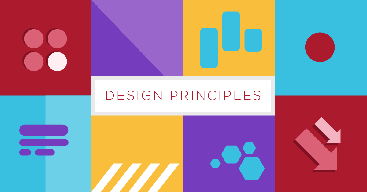
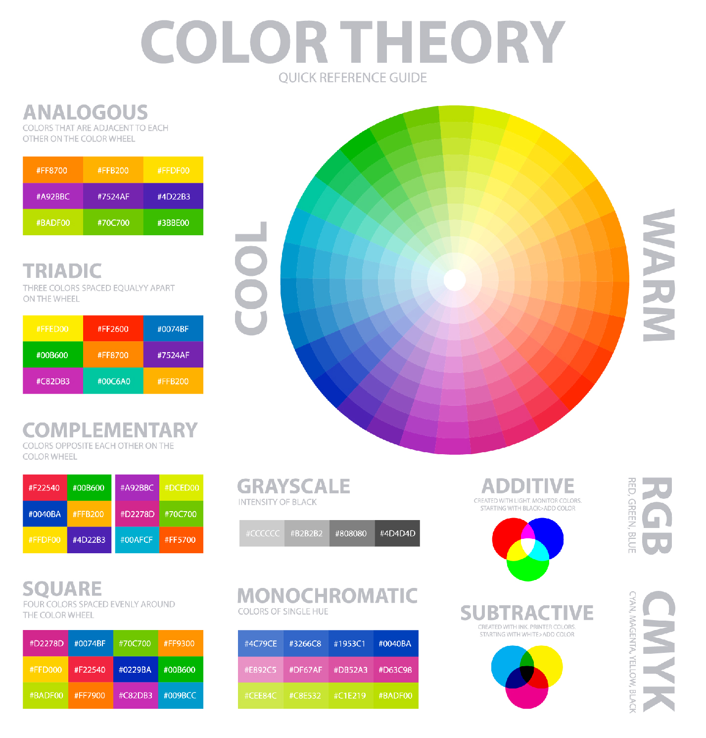
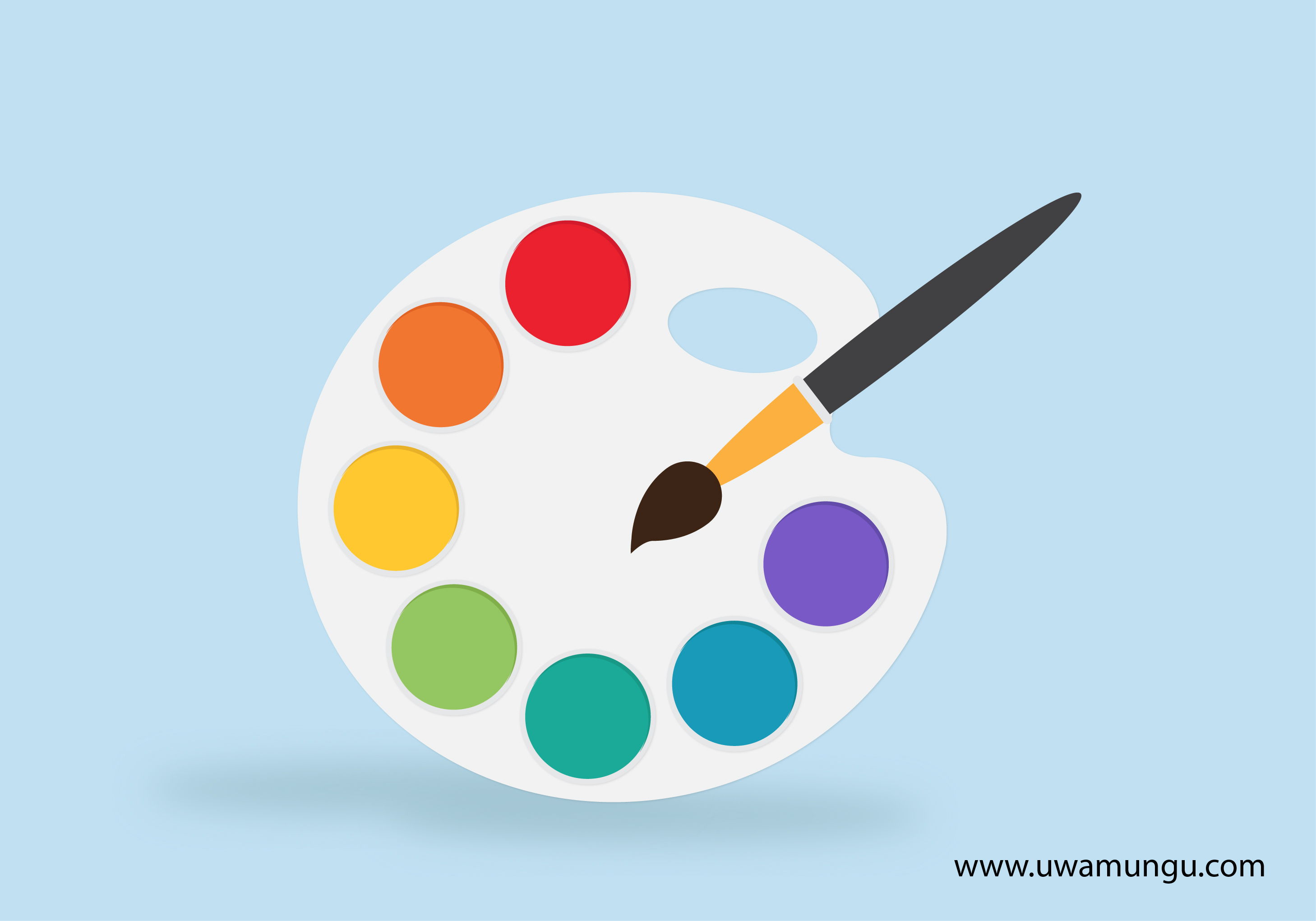
Color theory will help you build your brand. And that will help you get more sales.
The following are the baseline of this theory:
1~ RGB: the additive color mixing model
2~ CMYK: the subtractive color mixing model
3~ Color wheel basics
4~ Hue, shade, tint, tone
5~ Complementary colors
6~ Triadic colors
7~ Analogous colors
Understanding the color
Color is perception. Our eyes see something (the sky, for example), and data sent from our eyes to our brains tells us it’s a certain color (blue). Objects reflect light in different combinations of wavelengths. Our brains pick up on those wavelength combinations and translate them into the phenomenon we call color.
When you’re strolling down the soft drink aisle scanning the shelves filled with 82 million cans and bottles and trying to find your six-pack of Coke, what do you look for? The scripted logo or that familiar red can?
People decide whether or not they like a product in 90 seconds or less. 90% of that decision is based solely on color. So, a very important part of your branding must focus on color.
Two words: branding and marketing
No wait, three words: branding, marketing and sales. With this basic knowledge about colors and color schemes, you’re prepared to make effective branding decisions. Like what color your logo should be. Or the emotions that colors evoke in a consumer and the psychology behind color choices on your website. Think it doesn’t matter? Take a look at this article on color combinations from hell. It just hurts. Not only can knowledge of color theory guide you in your own marketing, it can also help you better understand what your competition is doing.Use a color in your own way
In a side-by-side comparison of random web pages, you’ll notice a variety of different color schemes. Blue is generally associated with dependability, brown with masculinity, and yellow with competence and happiness. All of these are positive associations in a field that stereotypically has negative connotations, such as dishonesty or aggression. Making your brand stand out and appeal to your target, plus understanding that poor colors can mean poor sales—that’s why you should care about color theory.Thank you for visiting my blog
UWAMUNGU Thierry
But did you know color also plays a major factor on your customer's first impressions of your brand? People generally make up their minds on how they feel about a product within the first 90 seconds -- and about 62-90 percent of their assessment is based on colors alone. The right colors can engage your audience and showcase your brand's individuality in a way words cannot. To stand out against your competitors, and to ensure consistency across all your marketing materials, it's critical you put time and effort into creating an impressive color palette.
A color palette can help you ensure uniformity across your website, promotional materials, social media content, and more. This consistency is key to attracting and retaining a loyal audience across all your platforms and channels.
Now, you might be thinking -- great, I'm convinced. But how do I get started? To make it easy for you, we've compiled useful color palettes to help you make great designs on your own
Use the following Color Palette Generators
To gain further inspiration or create unique color palettes for yourself, you might consider using an online color palette generator. Color palette generators are extraordinarily helpful -- they suggest colors that look good together, and even provide the hex color numbers, so you can plug the colors directly into a program like Photoshop. Before you begin your next design project, you might want to try generating different palettes of your own using one of these free online tools:
1~ Coolors
2~ Canva
3~ Colormind
4~ ColorSpace
Thank you for visiting my blog
UWAMUNGU Thierry
Contact
Address
Kigali-Rwanda
Phone
+250 788 882 871
thierry@uwamungu.com